Case Study · Interaction Design
How do you sell freshness through a screen?
Scroll
Case Study · Interaction Design
Challenge
Three goals shaped Shore
Build a Sea-to-Door tracking system that makes the catch's journey visible and trustworthy without the buyer needing to be there in person.
Replace a fragmented, manual process with a seamless digital experience that works for both home consumers and commercial buyers.
Use a clean, architectural design language that positions Shore as the premium standard in Mumbai's seafood market.
Purpose
Shore is built to make buying seafood in Mumbai simpler and more reliable. Since the current market is fragmented and hard to navigate, this app brings everything into one place. It focuses on creating a clean "Sea-to-Door" flow that helps users order quickly while feeling confident about the process — turning a complicated manual trade into a straightforward digital experience.
Before touching Figma, I visited two fish markets across two cities — Panjim Fish Market in Goa and Bandra Fish Market in Mumbai — and spoke with 10–12 vendors, regular home buyers, working professionals, housewives, and restaurant owners. The goal wasn't to validate assumptions. It was to understand how trust actually gets built between a buyer and a seller when the product is as perishable as a morning catch.
What I found changed the direction of Shore entirely.

Before any wireframes, I mapped the physical journey — from catch to doorstep — to understand every handoff where trust could break down.
"I came at 9 and the crabs were already gone. I don't know when to show up."
Availability at the market is completely unpredictable. Shellfish, crabs, and rare catches disappear within the first hour. Working buyers who arrive later consistently get less variety and worse quality — not because the market failed them, but because they had no way of knowing what was there and when. This became Shore's first design problem: visibility before arrival.
"How do I know it's fresh? It's all cold, it all looks the same to me."
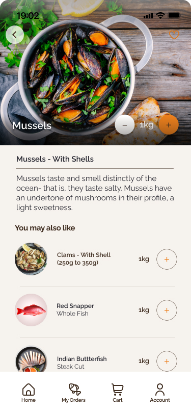
Occasional buyers have no reliable way to assess freshness. The ice creates a false visual parity — a fish caught yesterday looks identical to one caught this morning. Shore needed to make the catch's journey legible — not just show a product, but prove its provenance.
"The aunty before me paid half the price for the same pomfret."
Pricing at the market is entirely relational. Vendors adjust based on who's asking, how confident they seem, and whether they're a regular. New buyers consistently overpaid compared to daily regulars. This made transparent, fixed pricing one of Shore's core trust signals — not just a feature.
"I didn't even know I could ask for it to be cleaned a certain way."
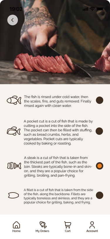
Occasional buyers don't know that cutting instructions are even an option. Many take fish home whole because they didn't know to ask for fillets, steaks, or curry cuts. This gap shaped Shore's guided cutting instructions step — making expert knowledge accessible to everyone.
Housewives who visited daily knew which vendor had the best pomfret on Tuesdays, which stall restocked at 7am. Shore's opportunity was to encode that local knowledge into the product so every user, regardless of experience, could shop like a regular.
What this meant for design
The research didn't just inform the design — it justified it.
Sea-to-Door tracking addresses Insight 02 — making freshness visible and provable.
Fixed transparent pricing addresses Insight 03 — removing the relational advantage vendors held.
Guided cutting instructions addresses Insight 04 — democratising expert knowledge at checkout.
Real-time availability addresses Insights 01 & 05 — giving every buyer the early-riser's advantage.
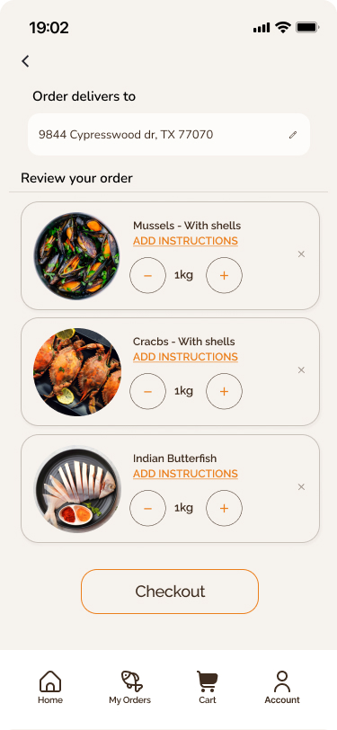
Two discovery entry points converging into a unified checkout with guest and returning user paths.
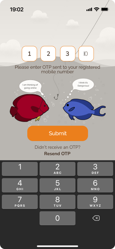
User flow mapping two entry points — browse and search — converging into a unified checkout experience. The auth layer supports both returning users (phone + OTP) and new users (registration), keeping the critical path as short as possible.
Before visual polish, I focused on making navigation feel intuitive and organised, even on a small mobile screen.


Designer's note
Once the logic was clear, I moved into low-fidelity wireframes. This stage was about getting the structure right — I focused on making the navigation as simple as possible so that browsing through different categories of seafood felt intuitive and organised, even on a small mobile screen.
The final experience centres around three moments — designed to feel just as direct as buying from your trusted fishmonger.
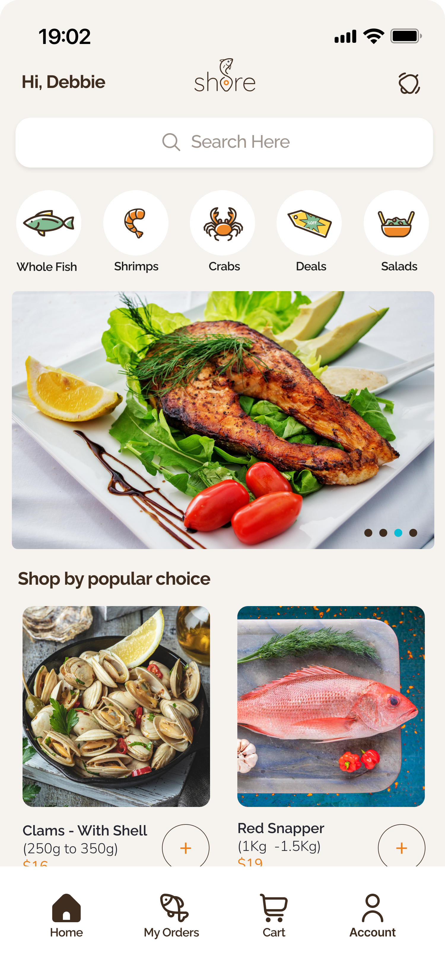
01 — Check
Glanceable condition card on arrival — is it fresh, where is it from, when was it caught.
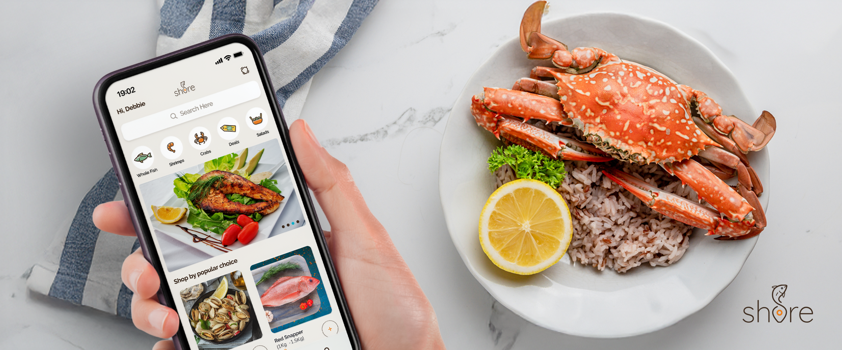
02 — Explore
Browse by category or search with real-time availability so rare catches don't disappear on you.
03 — Order
A 3-step flow with guided cutting instructions, fixed pricing, and seamless checkout.
The prototype covers the core Sea-to-Door flow — from browsing by category to placing an order with cutting instructions. Best experienced on mobile.
Interactive Figma prototype — tap or click through the core user journey from home to order confirmation.
Reflection
"Building Shore taught me how to take a messy, real-world process and turn it into a clean digital product."
I learned that when you're dealing with a traditional market, the design has to do more than just look good — it has to build trust. By focusing on a clear "Sea-to-Door" flow, I was able to create a system that feels both modern and reliable.
What I'd do differently
Invest earlier in community profiles and social trust layer — I underestimated how much vendor identity mattered to buyers' confidence.
What's next for Shore
A proactive notification system so returning users get alerts about rare catches before they disappear — the early-riser's advantage, automated.